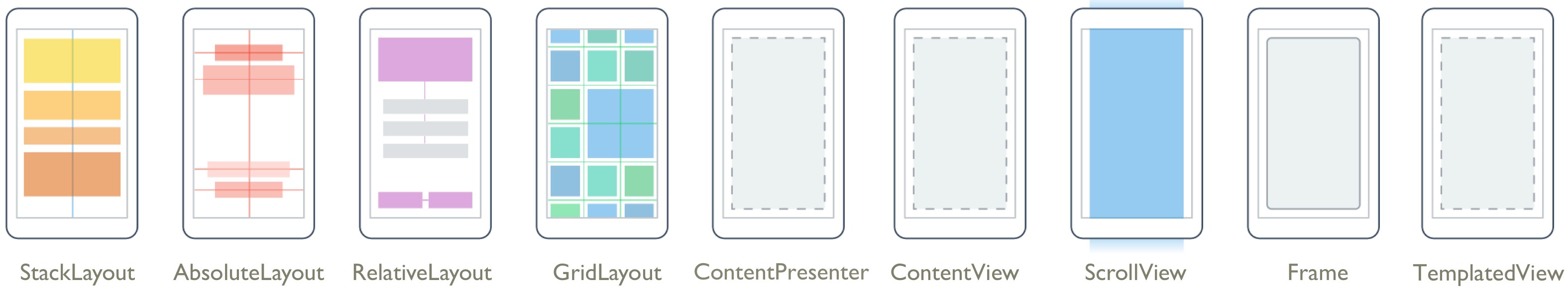
We will summarize the controls (ListView) that is able to display lists in Xamarin.forms, we will explain some properties used.
<StackLayout>
<ListView x:Name="MyListView"/>
</StackLayout>
In MainPage.xaml.cs, we will add this C# code as follows:
// iOS only, take a margin at the top
this.Padding = new Thickness(0, Device.OnPlatform(20, 0, 0), 0, 0);
// Generate a ListView
// Create a list of 100 lines "item-0 ~ item-99"
this.MyListView.ItemsSource = Enumerable.Range(0, 100).Select(n => $"item-{n}");
And the result is:


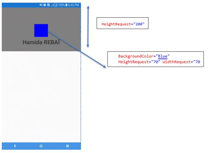
Create a custom ViewCell for confirmation, the height of BoxView will change according to the slider. By calling Cell.ForceUpdateSize () according to the MeasureInvalidated event of the StackLayout root element, the cell size of the ListView is updated.
C# Code:
We will add a new Class named: MyViewCell that Inherit from ViewCell:
public class MyViewCell : ViewCell
{
public MyViewCell()
{
var label = new Label();
label.SetBinding(Label.TextProperty,
".", BindingMode.OneWay);
var slider = new Slider
{
Maximum = 100,
Minimum = 0,
Value = 50,
};
var boxView = new BoxView
{
Color = Color.Blue,
BindingContext = slider,
};
boxView.SetBinding(VisualElement.HeightRequestProperty,
"Value", BindingMode.OneWay);
var stackLayout = new StackLayout
{
Children = {
label,
slider,
boxView,
},
};
// Here, Cell size of ListView is updated
stackLayout.MeasureInvalidated +=
(sender, e) => ForceUpdateSize();
View = stackLayout;
}
}
In MainPage.xaml.cs we will write this code C#:
InitializeComponent();
// iOS only, take a margin at the top
this.Padding = new Thickness(0, Device.OnPlatform(20, 0, 0), 0, 0);
this.MyListView.HasUnevenRows = true;
this.MyListView.ItemsSource = new[] {1, 2, 3, 4, 5, 6,};
this.MyListView.ItemTemplate = new DataTemplate(typeof(MyViewCell));
And the result will be this:

I will pull it and update it and write a program that stops updating after 2 seconds.
<ListView x:Name="MyListView"
IsPullToRefreshEnabled="True"
Refreshing="MyListView_OnRefreshing" />
private async void MyListView_OnRefreshing(object sender, EventArgs e)
{
//Wait for 4 seconds processing
await Task.Delay(4000);
//Stop refreshing
this.MyListView.IsRefreshing = false;
}
Result:

How to use ListView
We will work in MainPage.xaml, we start by add this XAML code in MainPage.xaml as follows:<StackLayout>
<ListView x:Name="MyListView"/>
</StackLayout>
In MainPage.xaml.cs, we will add this C# code as follows:
// iOS only, take a margin at the top
this.Padding = new Thickness(0, Device.OnPlatform(20, 0, 0), 0, 0);
// Generate a ListView
// Create a list of 100 lines "item-0 ~ item-99"
this.MyListView.ItemsSource = Enumerable.Range(0, 100).Select(n => $"item-{n}");
And the result is:

Public property list of ListView
The number of properties of the ListView control is more than other controls, and there are things that are hard to understand so I will go out carefully. Also, unless otherwise noted in the code behind, I will write XAML after using the above.
Footer property
Gets or sets the string, binding, or view to be displayed at the bottom of the list view.
XAML:
<StackLayout>
<ListView x:Name="MyListView" Footer="This is Footer"/>
</StackLayout>
Result:

FooterTemplate property
Gets or sets the data template to use for formatting the data object displayed at the bottom of the list view.
If only the Footer property was set, only characters could be set. By using the FooterTemplate property you can change the way the footer is expressed.
XAML:
<ListView x:Name="MyListView"
Footer="This is Footer">
<ListView.FooterTemplate>
<DataTemplate>
<Label Text="{Binding}"
FontSize="30"/>
</DataTemplate>
</ListView.FooterTemplate>
</ListView>
Result:

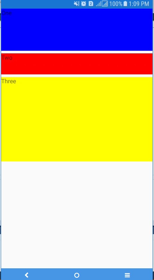
GroupDisplayBinding Property · IsGroupingEnabled Property
Gets or sets the binding used to display the group header.
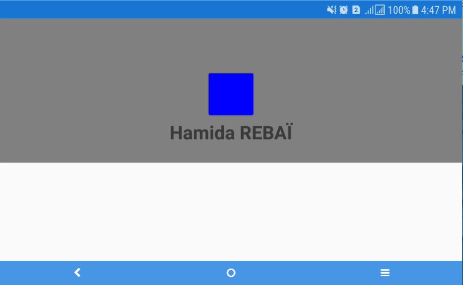
You can group in the list by using the GroupDisplayBinding property, At the same time, I will set the IsGroupingEnabled property to True.
XAML in MainPage.xaml
<ListView x:Name="MyListView"
IsGroupingEnabled="True"
GroupDisplayBinding="{Binding SectionLabel}" />
C# Code-Behind in MainPage.xaml.cs
public class GroupingItem : ObservableCollection<string>
{
public string SectionLabel { get; set; }
}
readonly ObservableCollection<GroupingItem> _items = new ObservableCollection<GroupingItem>();
public MainPage()
{
InitializeComponent();
// iOS only, take a margin at the top
this.Padding = new Thickness(0, Device.OnPlatform(20, 0, 0), 0, 0);
// Generate a ListView
// Create a list of 100 lines "item-0 ~ item-99"
this.MyListView.ItemsSource = Enumerable.Range(0, 100).Select(n => $"item-{n}");
//Participants section created
var item = new GroupingItem
{
SectionLabel = "Participants",
};
//Add each name to a section of a Participants
item.Add("Hamida REBAI");
item.Add("Rayen Trabelsi");
item.Add("Mohamed trabelsi");
_items.Add(item);
//Topics section created
item = new GroupingItem
{
SectionLabel = "Topics",
};
//Add a name to a Topic's section
item.Add("ASP.NET Core 2.0");
item.Add("Learning Cloud in Azure");
item.Add("Introduce XAMARIN");
_items.Add(item);
//Set grouping item to ItemsSource of ListView
MyListView.ItemsSource = _items;
}
Result:

GroupHeaderTemplate property
Gets or sets the DataTemplete of the group header.
The GroupDisplayBinding property could only represent the text of the header.
By using the GroupHeaderTemplate property you can change the representation of the value.
As a rule of how it feels the same as the FooterTemplate property.
Result:

MainPage.xaml.cs is the same as the GroupDisplayBinding property part.
GroupShortNameBinding property
Gets or sets the binding of the name displayed in the grouped jump list.
The GroupShortNameBinding property can only be used on iOS. I can display what is grouping on the right side of the screen.
XAML:
<ListView x:Name="MyListView"
IsGroupingEnabled="True"
GroupShortNameBinding ="{Binding SectionLabel}" />
Result in Android but it's different in iOS

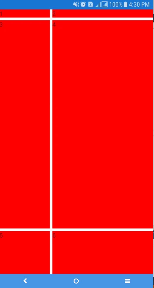
HasUnevenRows property
Gets or sets a Boolean value that indicates whether this ListView element has nonuniform rows.
HasUnevenRows property is a property that makes the height of list view non-uniform. The height is automatically set according to the contents of the list view.
XAML:
<ListView x:Name="MyListView" HasUnevenRows="true"/>
And C# Code-Behind
InitializeComponent();
// iOS only, take a margin at the top
this.Padding = new Thickness(0, Device.OnPlatform(20, 0, 0), 0, 0);
this.MyListView.ItemsSource = new List<string>
{
"Xamarin Forms is based on the XAML / WPF model" ,
"MVVM divides an application into three layers:",
"The Model provides underlying data, sometimes involving file or web accesses.",
"The ViewModel connects the Model and the View.",
"It helps to manage the data" ,
"The View is the user interface or presentation layer, generally implemented in XAML."
};
Result:

It seems that it is not reflected if it is only letters...
You can change the size of the cell dynamically. Android has been dynamically resized originally, but if Cell.ForceUpdateSize() you call it with this change, the size will be updated.
"Depending on the platform, the cost of treatment is high", in fact, it is slow to follow the update of the size when used on iOS.
Example:Create a custom ViewCell for confirmation, the height of BoxView will change according to the slider. By calling Cell.ForceUpdateSize () according to the MeasureInvalidated event of the StackLayout root element, the cell size of the ListView is updated.
C# Code:
We will add a new Class named: MyViewCell that Inherit from ViewCell:
public class MyViewCell : ViewCell
{
public MyViewCell()
{
var label = new Label();
label.SetBinding(Label.TextProperty,
".", BindingMode.OneWay);
var slider = new Slider
{
Maximum = 100,
Minimum = 0,
Value = 50,
};
var boxView = new BoxView
{
Color = Color.Blue,
BindingContext = slider,
};
boxView.SetBinding(VisualElement.HeightRequestProperty,
"Value", BindingMode.OneWay);
var stackLayout = new StackLayout
{
Children = {
label,
slider,
boxView,
},
};
// Here, Cell size of ListView is updated
stackLayout.MeasureInvalidated +=
(sender, e) => ForceUpdateSize();
View = stackLayout;
}
}
In MainPage.xaml.cs we will write this code C#:
InitializeComponent();
// iOS only, take a margin at the top
this.Padding = new Thickness(0, Device.OnPlatform(20, 0, 0), 0, 0);
this.MyListView.HasUnevenRows = true;
this.MyListView.ItemsSource = new[] {1, 2, 3, 4, 5, 6,};
this.MyListView.ItemTemplate = new DataTemplate(typeof(MyViewCell));
And the result will be this:

Header property
Gets or sets a string, binding, or view to be displayed at the top of the list view.
It is a property that you can set the header. It is the same as footer as a lick of usage.
XAML:
<StackLayout>
<ListView x:Name="MyListView" HasUnevenRows="true" Header="This is my Header!"/>
</StackLayout>
C# Code Behind:
We keep a previous sample:
this.MyListView.ItemsSource = Enumerable.Range(0, 100).Select(n => $"item-{n}");
Result:

XAML:
<StackLayout>
<ListView x:Name="MyListView" HasUnevenRows="true" Header="This is my Header!"/>
</StackLayout>
C# Code Behind:
We keep a previous sample:
this.MyListView.ItemsSource = Enumerable.Range(0, 100).Select(n => $"item-{n}");
Result:

HeaderTemplate property
Gets or sets the data template to use for formatting the data object displayed at the top of the list view.
I can change the expression of the header. As a way to use it together with the FooterTemplate property.
XAML:
<StackLayout>
<ListView x:Name="MyListView" HasUnevenRows="true" Header="This is my Header!">
<ListView.HeaderTemplate>
<DataTemplate>
<Label Text="{Binding}" FontSize="30"></Label>
</DataTemplate>
</ListView.HeaderTemplate>
</ListView>
</StackLayout>
Same C# Code-Behind of the previous example.

IsPullToRefreshEnabled property
Gets or sets a value that indicates whether the user should swipe and update the application.
The default is false.
IsPullToRefreshEnabled property is set to whether to pull an update.I will pull it and update it and write a program that stops updating after 2 seconds.
IsRefreshing property
Gets or sets a value indicating whether the list view is currently being updated.
The IsRefreshing property allows you to set whether the update is complete.
RefreshCommand property
Gets or sets the command to be executed when the list view is updated.
XAML:
<ListView x:Name="MyListView"
IsPullToRefreshEnabled="True"
Refreshing="MyListView_OnRefreshing" />
C# Code-Behind
We keep the same ItemSource but we will add a new Methodprivate async void MyListView_OnRefreshing(object sender, EventArgs e)
{
//Wait for 4 seconds processing
await Task.Delay(4000);
//Stop refreshing
this.MyListView.IsRefreshing = false;
}
Result:

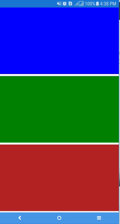
RowHeight property
Gets or sets the value representing the height of the line.
The RowHeight property is a property that allows you to set the height of an item.
XAML:
<ListView x:Name="MyListView"
RowHeight="150" />
Result:

XAML:
<ListView x:Name="MyListView"
RowHeight="150" />
Result:

SelectedItem Property
Gets or sets the currently selected item from ListView.ItemsSource.
In the SelectedItem property, you can set the items to select. Here I will let you select item - 5.
XAML:
<ListView x:Name="MyListView"
SelectedItem="item-5" />
Or we can force the selection in the CodeBehind part:
MyListView.SelectedItem = "item-5";
Result:

XAML:
<ListView x:Name="MyListView"
SelectedItem="item-5" />
Or we can force the selection in the CodeBehind part:
MyListView.SelectedItem = "item-5";
Result:

SeparatorColor Property
Gets or sets the color of the bar separating the list items.
In the SeparatorColor property, you can change the color of the separator line for each item. I will change it to Blue here.
XAML:
<ListView x:Name="MyListView" SeparatorColor="Blue" />

XAML:
<ListView x:Name="MyListView" SeparatorColor="Blue" />

SeparatorVisibility property
Gets or sets a value indicating whether a separator is displayed between items.
Possible values are Default · None, initial value is Default.
In the SeparatorVisibility property, you can set whether or not to show separator lines for each item. Here I will set None and try clearing the separator line.
XAML:
<ListView x:Name="MyListView" SeparatorVisibility="None" />
Result:


XAML:
<ListView x:Name="MyListView" SeparatorVisibility="None" />
Result:

Public Event List of ListView
In this part I will summarize the ListView's event method.
ItemAppearing event
An event that fires when the visual representation of an item is added to the visual layout.
XAML:
<!--ListView-->
<ListView x:Name="MyListView"
ItemsSource="{Binding Mode=TwoWay}"
ItemAppearing="MyListView_OnItemAppearing" />
<!-- Add new element -->
<Button x:Name="AddNameBtn"
Text="ListView Add Item"
FontSize="20"
Clicked="AddNameBtn_OnClicked" />
<!-- Delete all elements -->
<Button x:Name="DeleteNameBtn"
Text="ListView delete all Items"
FontSize="20"
Clicked="DeleteNameBtn_OnClicked"/>
C# CodeBehind
public List<string> ItemSource { get; set; } = Enumerable.Range(1, 5)
.Select((x, index) => $"{index}- Element")
.ToList();
public MainPage()
{
InitializeComponent();
// iOS only, take a margin at the top
this.Padding = new Thickness(0, Device.OnPlatform(20, 0, 0), 0, 0);
MyListView.ItemsSource = ItemSource;
}
private void AddNameBtn_OnClicked(object sender, EventArgs e)
{
//Add item
this.ItemSource.Add($"{this.ItemSource.Count}- Element");
//Once you have to empty the ListView
MyListView.ItemsSource = null;
//ItemsSource in ListView
MyListView.ItemsSource = ItemSource;
}
private void DeleteNameBtn_OnClicked(object sender, EventArgs e)
{
this.ItemSource.RemoveAll(x => true);
MyListView.ItemsSource = null;
}
private void MyListView_OnItemAppearing(object sender, ItemVisibilityEventArgs e)
{
//throw new NotImplementedException();
}
Result

If we click on "ListView delete all Items" Button, we delete all elements.

If we click on "ListView Add Item" Button, we add a new element as shown: 6- Element

As you can see by following step execution, it seems that the ItemAppearing event is firing for each item at the timing of actual drawing, not at the timing added to the ItemsSource property. So in this program, five ItemAppearing events are firing.
ItemDisappearing event
This event fires when the visual representation of the item is deleted from the visual layout.
Likewise, the ItemDisappearing event fires for the number of deleted items.
In XAML
<ListView x:Name="MyListView"
ItemsSource="{Binding Mode=TwoWay}"
ItemAppearing="MyListView_OnItemAppearing"
ItemDisappearing="MyListView_OnItemDisappearing"/>
C# CodeBehind
private void MyListView_OnItemDisappearing(object sender, ItemVisibilityEventArgs e)
{
}
ItemSelected event
It is an event that fires when an item is selected.
The ItemSelected event fires when an item of the ListView control is selected.
XAML:
<ListView x:Name="MyListView"
ItemSelected="MyListView_OnItemSelected"
/>
<Label x:Name="LblSelected"
FontSize="50"/>
in C# CodeBehind
public List<string> ItemSource { get; set; } = Enumerable.Range(1, 5)
.Select((x, index) => $"{index}- Element")
.ToList();
public MainPage()
{
InitializeComponent();
// iOS only, take a margin at the top
this.Padding = new Thickness(0, Device.OnPlatform(20, 0, 0), 0, 0);
MyListView.ItemsSource = ItemSource;
}
private void MyListView_OnItemSelected(object sender, SelectedItemChangedEventArgs e)
{
this.LblSelected.Text = e.SelectedItem.ToString();
}
Result :

You can see it by stepping through the above code, but the ItemTapped event fires after the ItemSelected event fires.
ItemTapped event
It is an event that fires when an item is tapped.
The ItemSelected event is not fired when the same item as the previous item is selected, but the ItemTapped event will fire when the item is tapped.
For the ItemTapped event, we have Group information. I attempted to give an example using this information, but since I could not use it well, I will skip it here.
XAML
<ListView x:Name="MyListView"
ItemSelected="MyListView_OnItemSelected"
ItemTapped="MyListView_OnItemTapped"
/>
C# CodeBehind Event:
private void MyListView_OnItemTapped(object sender, ItemTappedEventArgs e)
{
this.LblSelected.Text = e.Item.ToString();
}
Result:

Refreshing event
The event that fires when the list view is updated.
The Refreshing event is an event that will fire when refreshing ~. It is good to use IsPullToRefreshEnabled property and IsRefreshing property when refreshing.
IsPullToRefreshEnabled property is set to whether to pull and update. The IsRefreshing property allows you to set whether the update is complete ~. I will pull it and update it and write a program that stops updating after 2 seconds.
See sample of sPullToRefreshEnabled property.
Public Method List of ListView
BeginRefresh () method
Set the ListView.IsRefreshing property to true and enter the refresh state.
XAML:
<ListView x:Name="MyListView" />
<!--Make a refresh state-->
<Button x:Name="RefreshBtn"
Text="Refresh State"
FontSize="20"
Clicked="RefreshBtn_OnClicked"/>
/>
In MainPage.xaml.cs CodeBehind
private void RefreshBtn_OnClicked(object sender, EventArgs e)
{
MyListView.BeginRefresh();
}
We have the same example and the result is:

EndRefresh () method
Set the ListView.IsRefreshing property to false and end the refresh state.
<ListView x:Name="MyListView" />
<!--Make a refresh state-->
<Button x:Name="RefreshBtn"
Text="Refresh State"
FontSize="20"
Clicked="RefreshBtn_OnClicked"/>
<!-- Button to stop fresh state-->
<Button x:Name="StopRefreshBtn"
Text="Stop Refresh"
FontSize="20"
Clicked="StopRefreshBtn_OnClicked"/>
And the C# Code Behind:
private void StopRefreshBtn_OnClicked(object sender, EventArgs e)
{
MyListView.EndRefresh();
}
ScrollTo (Object, ScrollToPosition, Boolean) Method
Scroll the ListView to the item.
The method ScrollTo (Object, ScrollToPosition, Boolean) is a method that scrolls to the specified item. You can set which item to scroll (first argument), where to scroll (second argument), scroll using animation (third argument).
XAML:
<ListView x:Name="MyListView" />
<Picker x:Name="Picker"
SelectedIndexChanged="Picker_OnSelectedIndexChanged"/>
And in the code Behind:
public List<string> ItemSource { get; set; } = Enumerable.Range(1, 100)
.Select((x, index) => $"{index}- Item")
.ToList();
public MainPage()
{
InitializeComponent();
// iOS only, take a margin at the top
this.Padding = new Thickness(0, Device.OnPlatform(20, 0, 0), 0, 0);
MyListView.ItemsSource = ItemSource;
for (var i = 0; i < 100; ++i)
{
Picker.Items.Add($"{i} Item");
}
}
private void Picker_OnSelectedIndexChanged(object sender, EventArgs e)
{
var selectedItem = Picker.Items[Picker.SelectedIndex];
MyListView.ScrollTo(selectedItem, ScrollToPosition.Center, true);
}
Result:

If we select "40 Item" we will be scrolled in the ListView to the row containing the same value.

| Argument | Description |
|---|---|
| First argument (Object) | Set which item to scroll |
| Second argument (ScrollToPosition) | Set where to position after scrolling Possible settings are as follows -Center: Scrolls and displays the specified item in the center of the screen. - End: Items scrolled and specified will be displayed at the bottom of the screen. - MakeVisible: Scroll to display the specified list item. - Start: Scrolls the specified item on the screen. |
| Third argument (Boolean) | Set whether to use animation when scrolling. |
ScrollTo (Object, Object, ScrollToPosition, Boolean) Method
Scrolls the ListView to items in the group.
* Even if this code is executed, the intended result cannot be obtained.
In the ScrollTo (Object, Object, ScrollToPosition, Boolean) method, one argument is added, and you can specify a group.
XAML:
<ListView x:Name="MyListView"
IsGroupingEnabled="True"
GroupDisplayBinding="{Binding SectionLabel}" />
<Picker x:Name="PickerGroup" />
<Picker x:Name="PickerItem"
SelectedIndexChanged="PickerItem_OnSelectedIndexChanged"/>
And in C# CodeBehind:
public class GroupingItem : ObservableCollection<string>
{
public string SectionLabel { get; set; }
}
readonly ObservableCollection<GroupingItem> _items = new ObservableCollection<GroupingItem>();
// iOS only, take a margin at the top
this.Padding = new Thickness(0, Device.OnPlatform(20, 0, 0), 0, 0);
//Male section created
var item = new GroupingItem
{
SectionLabel = "Group 1",
};
_items.Add(SetGroupName(item));
//Create a handsome section
item = new GroupingItem
{
SectionLabel = "Group 2",
};
_items.Add(SetGroupName(item));
//Create an actor section
item = new GroupingItem
{
SectionLabel = "Group 3",
};
_items.Add(SetGroupName(item));
//Set grouping item to ItemsSource of ListView
MyListView.ItemsSource = _items;
//Assign group name
PickerGroup.Items.Add("Group 1");
PickerGroup.Items.Add("Group 2");
PickerGroup.Items.Add("Group 3");
//Assign item name
PickerItem.Items.Add("Name 1");
PickerItem.Items.Add("Name 2");
PickerItem.Items.Add("Name 3");
PickerItem.Items.Add("Name 4");
PickerItem.Items.Add("Name 5");
PickerItem.Items.Add("Name 6");
PickerItem.Items.Add("Name 7");
PickerItem.Items.Add("Name 8");
PickerItem.Items.Add("Name 8");
PickerItem.Items.Add("Name 10");
//Initial set of group names
PickerGroup.SelectedIndex = 0;
}
private GroupingItem SetGroupName(GroupingItem groupingItem)
{
groupingItem.Add("Name 1");
groupingItem.Add("Name 2");
groupingItem.Add("Name 3");
groupingItem.Add("Name 4");
groupingItem.Add("Name 5");
groupingItem.Add("Name 6");
groupingItem.Add("Name 7");
groupingItem.Add("Name 8");
groupingItem.Add("Name 9");
groupingItem.Add("Name 10");
return groupingItem;
}
private void PickerItem_OnSelectedIndexChanged(object sender, EventArgs e)
{
var selectedGroup = PickerGroup.Items[PickerGroup.SelectedIndex];
var selectedItem = PickerItem.Items[PickerItem.SelectedIndex];
MyListView.ScrollTo(selectedItem, selectedGroup, ScrollToPosition.Center, true);
}